
This is one of the photos from my recent visit to Yosemite National Park. The view is sunrise from the Tunnel View Overlook, and it’s said to be the most photographed vista in the park / nation / world, all depending on who’s making the claim. This particular morning, the clouds arrived at just the right time to catch the light from the sun rising behind the mountians, which created the brilliant colors you see here.
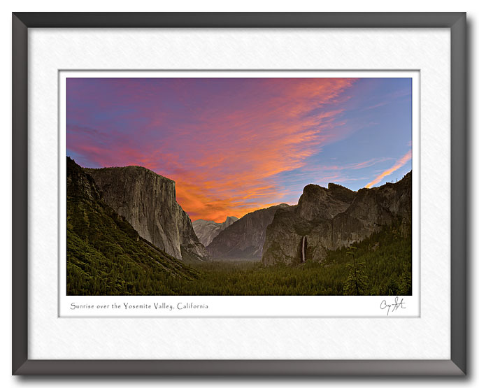
In fact, one of the interesting aspects of the image is the bright colors of the sunrise. If you’re not a photographer, you probably don’t think much about color, but if you’re trying to produce high quality photos and prints, then the details are important. The problem is that colors in the digital world are not all the same. The picture probably looks different on your monitor than it does on mine. And it’s not just the colors, if your monitor can’t display the colors correctly, then you probably just see a blob of orange color and don’t see the fine details in the wispy clouds. For a quick glance at a photo on a blog, it’s not all that important. But, when I make a 16 X 20 or 24 by 36 inch print, I want all of the detail in the clouds.
After working with this and similar photos, I decided to post a tutorial explaining more about the problem – what causes it and how to deal with it. If you’re interested, please take a look. But, if you’re not a photographer, you probably won’t get much out of it.